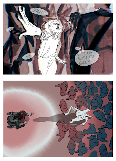
Material : ipad Process: I spent most of my time thinking about composition for this piece, and ultimately chose to use the character's center of gravity to break up the frame by dividing the negative space into black and white. In the process of drawing, I paid special attention to the simplicity of the lines, especially on the right side of the picture I left as much blank space as it can has, so as to make the picture look more intuitive and vivid with the maximum dynamic. The visual guidance in this picture is not particularly obvious, But we can see the entire line where the two characters overlap as the focus point, emphasizing the integrating of the two. I did not traditionally use yellow or any other high saturated color to represent contrast and brightness because i didn't want to, partly because it would be more consistent with the color of the previous work, partly because i like to keep the simplicity and a melancholic tone in this picture. Idea:This drawing is in ...